GUIDE: ADA ROOM SIGNAGE REQUIREMENTS
What Louisiana building owners, architects, and designers need to know for on-brand ADA compliance
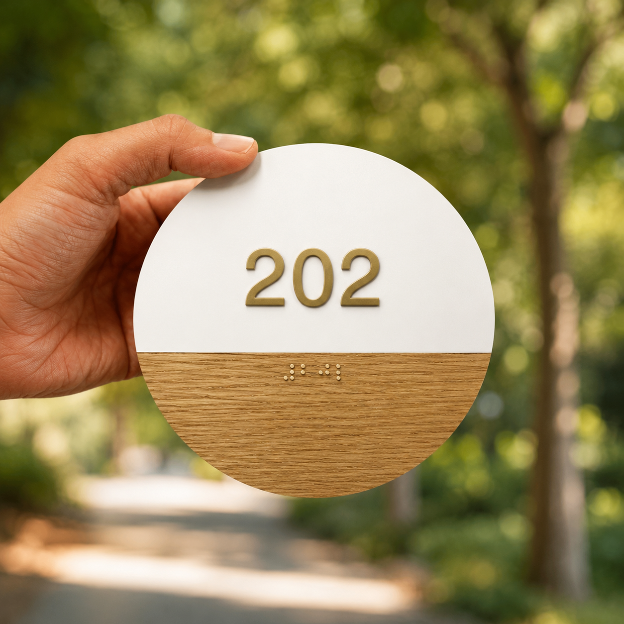
Single-faced multi-media ADA compliant room sign for Spyre Center by OPA Signs & Graphics.
Why ADA compliant signage matters
The Americans with Disabilities Act (ADA), signed into law in 1990, established standards intended to improve accessibility and remove barriers in physical spaces. More than three decades later, ADA guidelines continue to shape how commercial environments are designed.
ADA room signage requirements are one of the most frequently misunderstood parts of a development project. From tactile lettering to mounting height and braille specifications, ADA signage requirements Louisiana facilities must follow involve far more than simply adding braille to a plaque. Missing small details potentially leads to failed inspections, costly replacements, or challenges for people relying on signage to effectively use a space.
Meeting ADA standards while expressing your brand
The good news? When ADA considerations are addressed early compliance does not limit creativity. OPA Signs & Graphics helps clients interpret ADA signage requirements Louisiana commercial spaces must meet while maintaining a cohesive architectural aesthetic.
Below is a practical guide to the key ADA requirements for room identification signage, along with a few areas that commonly create confusion during the design and construction process.
Additional questions? OPA Signs & Graphics is here to help.
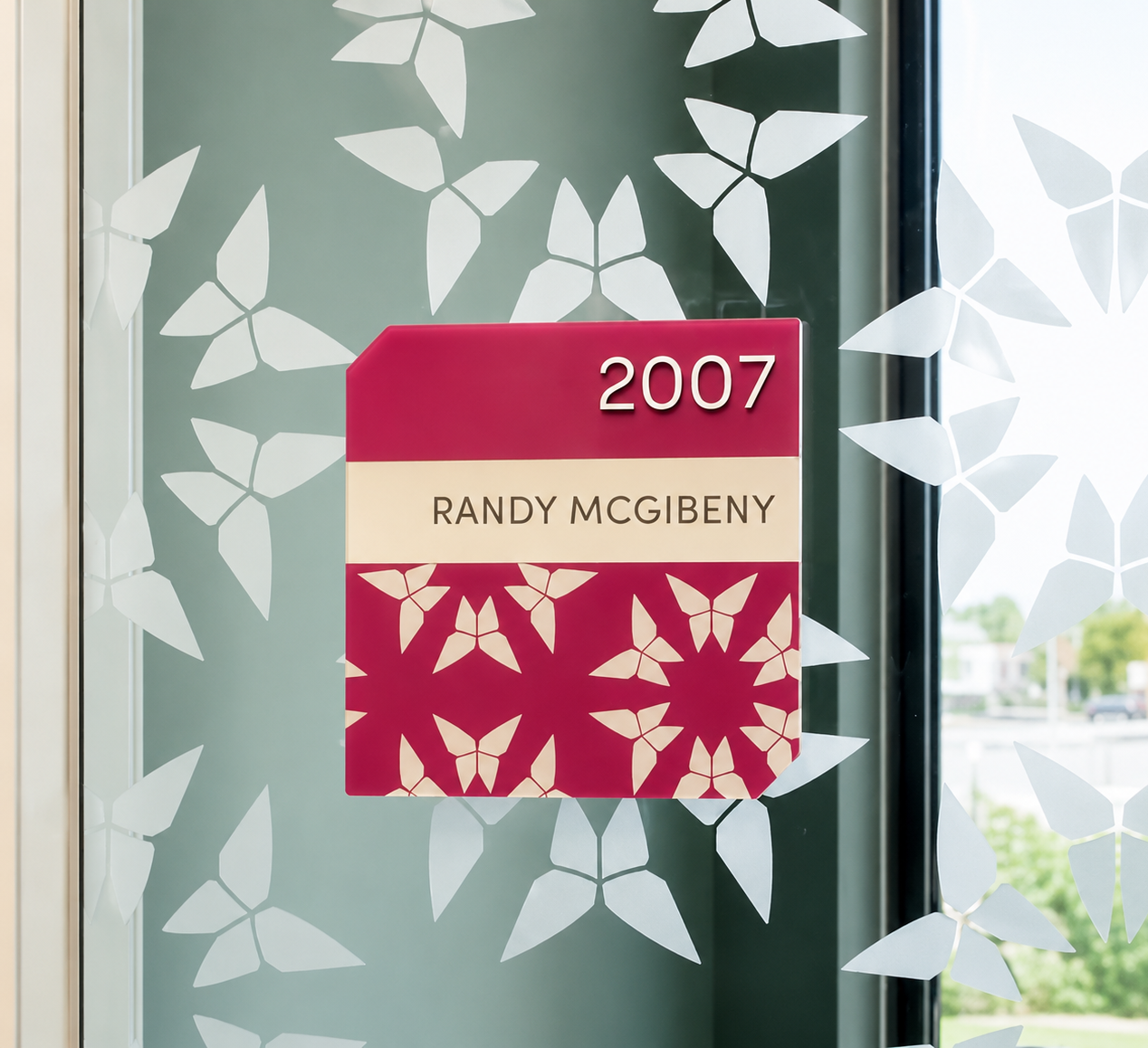
Highly branded and custom room identification signage by OPA Signs & Graphics for ChildSafe.
room requirements
What rooms require ADA signage? Because ADA signage requirements Louisiana public and commercial buildings must follow can vary by room type, early planning is essential.
ADA tactile room identification signs are required for permanent rooms, stairwells, elevators and exits. The purpose is to identify areas that have a fixed function or designation.
Typical spaces requiring ADA-compliant room identification signage include restrooms, conference rooms, offices, electrical and mechanical rooms, exit stairwells, storage rooms, patient rooms, classrooms, and employee break rooms.
TACTILE FONTS & COPY
Tactile lettering in ADA signage consists of raised characters designed to be read by touch, helping individuals who are blind or visually impaired identify rooms and navigate a facility independently. ADA standards regulate tactile letter height, stroke width, spacing, and case style to ensure consistent readability and accessibility.
The ADA does not specifically approve individual font families, but compliant signage typically uses clean, medium weight sans-serif styles. Many custom typefaces can still be compliant if proportions and spacing meet accessibility standards. Branding and ADA requirements can often coexist through thoughtful adaptation rather than abandoning a client's visual identity.
Font requirements
Uppercase
Sans serif
Medium stroke weight
No highly decorative lettering
No condensed or overly extended letterforms
No italic or script fonts
Measure between 5/8 inch and 2 inches in height
Maintain consistent stroke thickness
Common compliant fonts: Helvetica, Arial, Frutiger, Avenir, Futura, Acumin, Gotham

Sans serif (left) uppercase type is ADA compliant. Fonts that feature serifs (right), italics, are condensed or overly extended are non-compliant.
braille
Braille is a tactile reading system made up of raised dots that allows individuals who are blind or visually impaired to read through touch.
Not all braille used in ADA signage is created equal. ADA-compliant braille must follow strict standards for dot size, spacing, placement, and translation, making professionally fabricated tactile signage essential for both accessibility and code compliance.
Braille requirements
Positioned directly below corresponding tactile text
¼ inch height
3/8 inch clearance surrounding braille
PICTOGRAMS
A pictogram is a simple, recognizable graphic symbol used to communicate information visually without relying on text. In ADA signage, pictograms are commonly used on restroom, accessibility, and wayfinding signs to improve clarity and universal understanding. Tactile text and braille must accompany the symbol elsewhere on the sign. The pictogram does not replace tactile information.
Pictogram requirements
It must occupy an open field at least 6 inches high without text, braille or borders
The pictogram itself must be 4” minimum height
sign Finish & COLOR
ADA sign requirements in Louisiana mandate use of high-contrast colors and non-glare finishes to improve readability for individuals with visual impairments and low vision. Strong contrast helps tactile and visual characters stand out clearly, while matte, non-reflective surfaces reduce glare that can make signage difficult to read under lighting or sunlight.
Highly reflective finishes such as mirrored acrylic, polished metals, or glossy laminates can reduce readability and create visibility issues under changing lighting conditions.
Acceptable finishes
Matte acrylic
Satin metal
Brushed aluminum
Eggshell-painted surfaces
Wood with low-contrast grain
Installation Height & Placement
Consistent positioning helps individuals who are blind, visually impaired, or using mobility devices reliably locate and read signage safely without obstruction from doors, walls, or surrounding fixtures. Incorrect installation can create a violation even if the sign itself is compliant.
Installation location requirements
Lowest tactile text baseline: 48 inches minimum
Highest tactile text baseline: 60 inches maximum
Installation on the latch side of the door whenever possible
Clear floor space for approach and reading
CHANGEABLE COPY SIGNAGE
When rooms have multiple purposes or tend to have changing occupants the permanent room identifier (i.e. OFFICE or CONFERENCE) still requires tactile and braille compliance.
Variable information such as names, schedules, or temporary notices can often be handled separately with printed inserts or digital displays. This approach maintains accessibility while allowing operational flexibility.

Multi-layered ADA compliant room signage for Pearl Hotel in Bay St. Louis by OPA Signs & Graphics.
Accessibility & Design: Working Together
ADA room signage should be part of the conversation from the beginning, not an item checked off at the end of a project. At OPA Signs & Graphics, our team works alongside architects, designers, contractors, and property owners to incorporate ADA signage requirements Louisiana codes mandate into branded interior environments without sacrificing design quality.
From design development and material selection to code guidance and fabrication, OPA helps simplify the complexities of ADA compliance. Our team reviews room schedules, sign types, tactile requirements, and installation standards to help reduce surprises during permitting and final inspections.
Well-executed ADA signage is more than compliance. It creates spaces that are easier to navigate, more cohesive in appearance, and more welcoming for every visitor.
Contact our team to start the conversation.