CANAL PLACE
“Finally, a sign that captures who we are. It manages to feel high-end, substantial AND weightless.”
— Canal Place
channel letters • mirror finish
complex installation • rebranding

the client
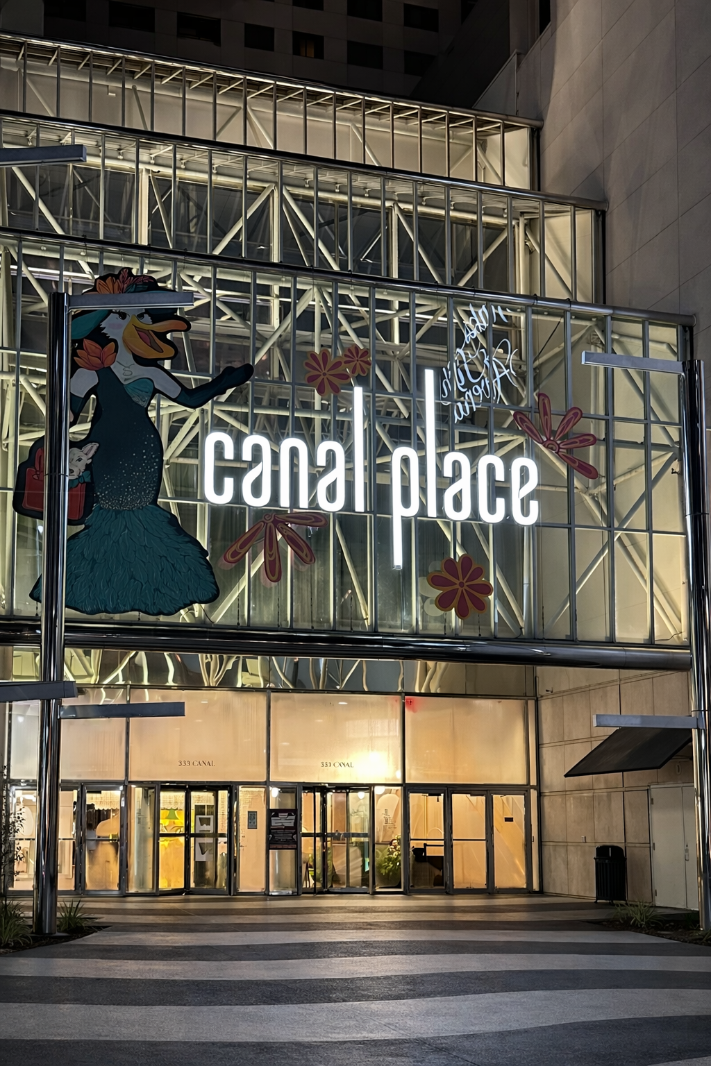
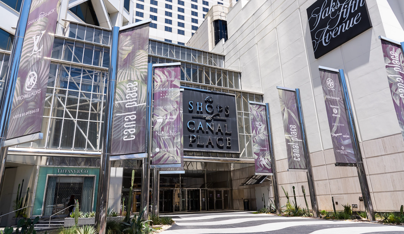
Canal Place is a refined retail landmark in the heart of New Orleans, blending national luxury with local character to create an experience that feels intentional and distinctly of the city.
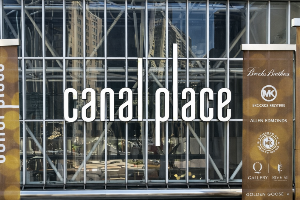
Its rebrand introduced a sleek, minimalist identity defined by elongated letterforms and a clean sans-serif typeface, reinforcing the clarity of the glass-enclosed atrium without competing with tenant brands like Saks Fifth Avenue, Anthropologie, and Lululemon.
the project
Canal Place began its rebrand from the inside out, prioritizing interior touchpoints like wayfinding, directories, frosted vinyl elevator docks, and dimensional logo elements.
With those quick-turnaround pieces in place, one major question remained: how to fabricate and install a new illuminated, mirrored channel letter logo on the downtown-facing glass façade.
our challenge
The previous signage avoided direct glass installation by relying on a massive, black-painted subframe. This was a functional, strong solution, but one that was at odds with Canal Place architecture instead of complementing it.
OPA needed a solution that appeared to float on Canal Place glass while standing up to significant wind loads and relentless UV exposure along the Mississippi River.
Getting the scale right, and choosing the right materials, would determine whether the sign felt heavy or effortless.
Previous Canal Place primary signage
solution
An early concept proposed a fabricated subframe spanning the atrium, but it proved labor-intensive and visually heavy. OPA put production on-hold to rethink the approach and see if there were opportunities to streamline.
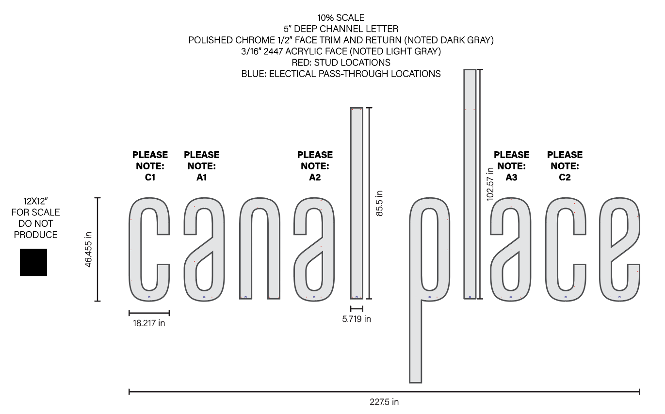
An extensive field survey by OPA Signs & Graphics mapped every mullion separating the individual glass panels, then overlaid the logo onto a digitized elevation. With subtle, imperceptible adjustments to kerning and the length of Canal Place’s ascenders and descenders, all mechanical attachment points were shifted off the glass entirely, allowing the existing building structure to do the heavy-lifting.
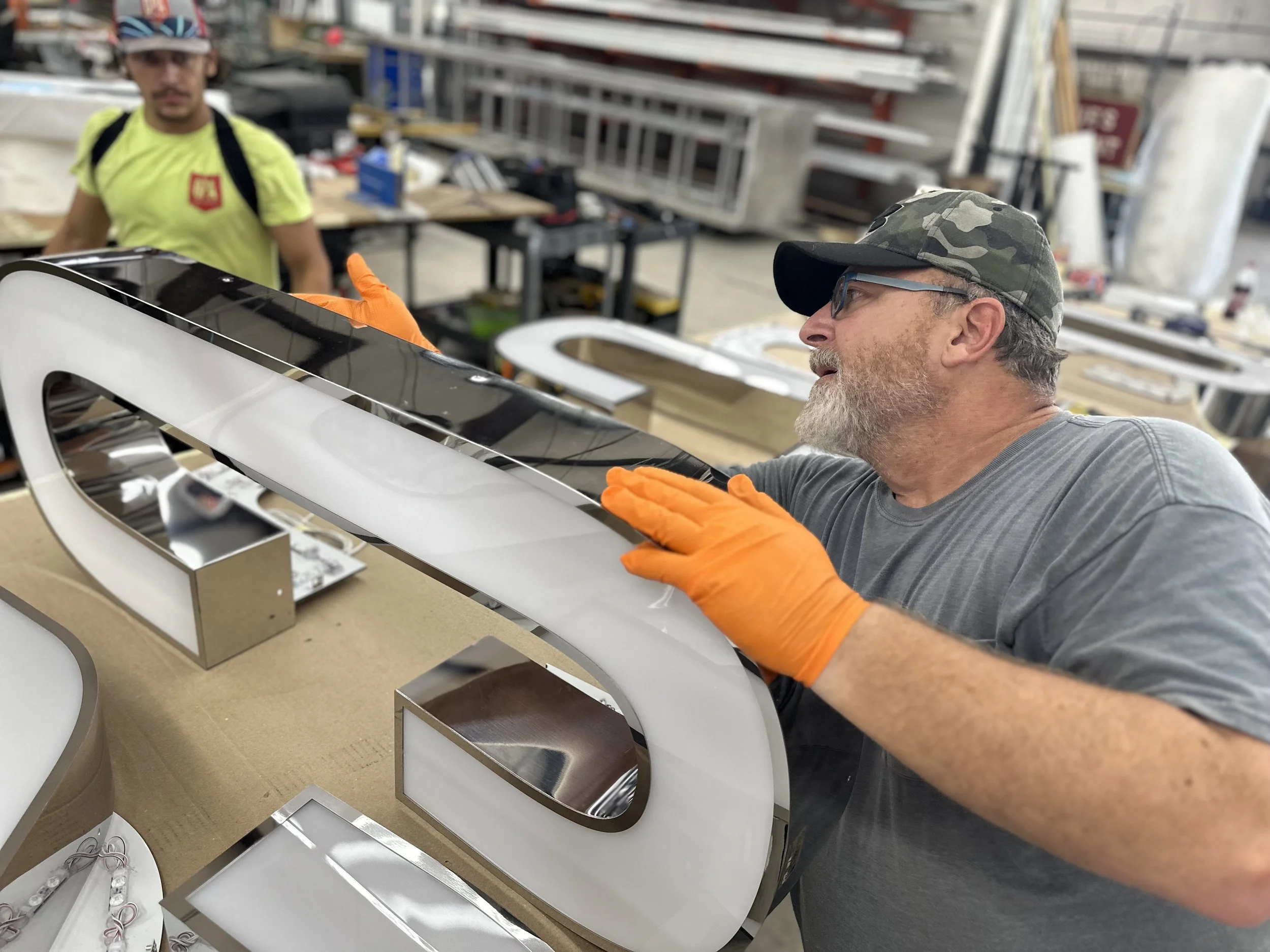
Each letter was CNC-routed with precision-placed mounting points to match the mullion map, and over the course of a single sunny day, the new mirror-finish illuminated letterset was installed cleanly, efficiently, and seemingly floating on the façade.